References - Revisited
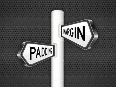
Following the great advice from Elias Keppens, Didier Forest and oVan, I made some corrections to the icon.
Changes made:
- The perspective of the inset lines on the pole have been modified to match the perspective when the camera is viewing from the front straight on.
- The perspective on the front part of the darker part of the panel has been corrected, now it gets a bit thinner at the top.
- The top highlight on the panels now fade off as they approach the pole to increase the sense of depht.
What do you think? Better?
More by Miro Keller View profile
Like
