Twin Rivers Logo Design
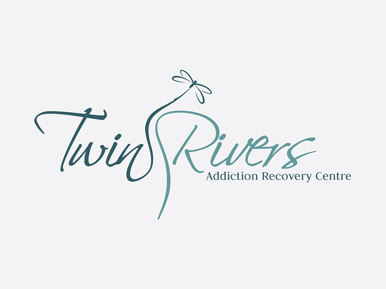
This logo is an interpretation of the twin rivers in Plettenberg Bay from where the name of the centre is derived. The logo depicts the rivers as soft and flowing – conveying the tranquil, healing and relaxing environment of the centre. The colour and font choice reflect this interpretation. The dragonfly resting on the one “river” symbolises renewal, positive energy and the power of life. It is a creature of water and air. It matures and leaves one way of life and takes wings to start another.