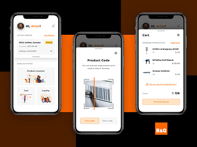
Optimizing experience in store with the new UI design
Hello Dribbblers!
Recently, we've come across a common problem appearing in hardware stores.
It would save you a lot of time if you didn't wait firstly for the shop assistant to help you find an item, and then avoid staying in a long queue to checkout, right?
We decided to find a relatively simple but yet effective solution for this, showing it on the B&Q example - one of the biggest hardware reatilers in the UK.
The main goal of the project was to improve the shopping experience and use the newest technologies like Visual Search and Mobile Payments.
This is how we approached this problem:
- improved the User Interface in the store's application
- reduced the number of steps in the customer journey
- optimized and designed a more agile way of adding products to the cart
- decreased the time spent in queues in the store
Design and idea by: https://dribbble.com/astepkovskyi
