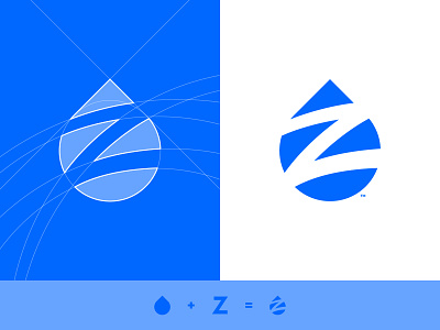
Ziptility - Logo Design
When choosing the brand colors for Ziptility, i came to the conclusion that the best solution was to move away from the obvious - the watery blue - since the water drop mark was enough to associate the brand with water. So, i went with another color associated with ecology - green, along with a deeper blue for the type.
For the type, i choosed something similar to the shapes of water pipes - Coolvetica - i think the mark and type match perfectly 🚰
Check out the second image to see the how the logo looks applied on a business card!
More by Wisecraft View profile
Like


