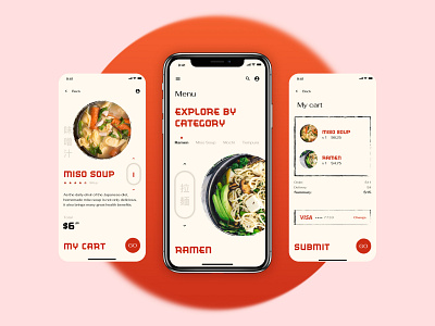
Ordering app concept
This week’s UI challenge embraces the Japanese culture. We had to come up with a different ordering experience for the customers of a Japanese restaurant.
Here’s my take on it.
I paid homage to traditional Japanese calligraphy by adding a paint brush effect to the text and image containers. The boxed navigational items, inspired by the Japanese shops’ front advertising, allow the user to jump through the different types of food items, as well as to choose the amount of portions they want to order.
More by Halcyon Mobile View profile
Like
