Moka Cash Register Web
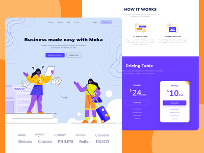
Hi Dribbblers, I try to redesign Moka Indonesian cash register website, here's the web https://www.mokapos.com/en. The concept is people on the left before using Moka seems messy and disorganized, the people on the right after using Moka seem easier as if on vacation, I Hope that customers after using Moka all the works will be easier.
I'm using "Okay" Landing Page UI Kit It's very clean and easy to edit I really recommend you to use it, you can purchase it on our creative market link bellow
Grab it fast only on UI8.net
- - - - - - - - - - - - - - - -
I'm available for new projects. Kindly email me at Randompopsycle@gmail.com
More by Randompopsycle View profile
Like
