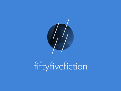
55Fiction logo
I'm running a freelance studio called 55Fiction and I finally got down to creating a good logo and branding. The stripes in the middle of the logo stand for the two five's and represent my minimalistic and subtle approach, while the dark circle represents my experimental and expressive approach. I chose Verlag as my logo type, as it's a great thin but strong font which fit perfectly with the lines in the logo.
I'm kind of in the middle about the lines though, having to choose between four or two lines. Here is the version with two lines: http://justren.nl/dribbleshotlogo2.jpg
I would love to hear critique about this, as I've spent a very long time on designing this logo already.
More by Edwin de Jongh View profile
Like
