Minimal landing colour choice

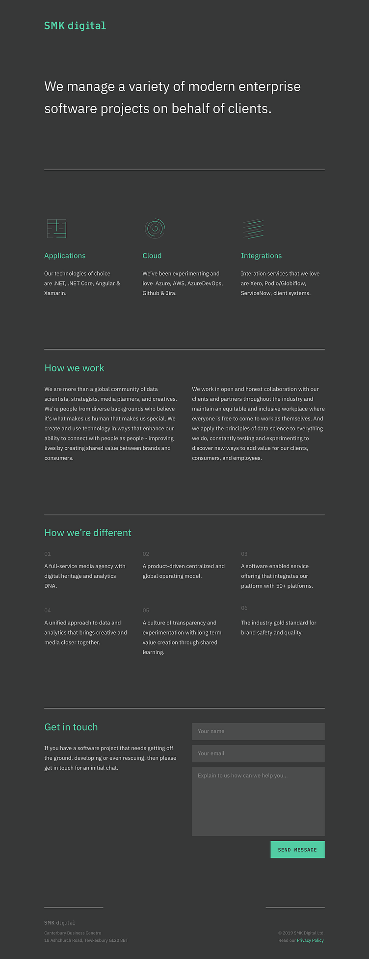
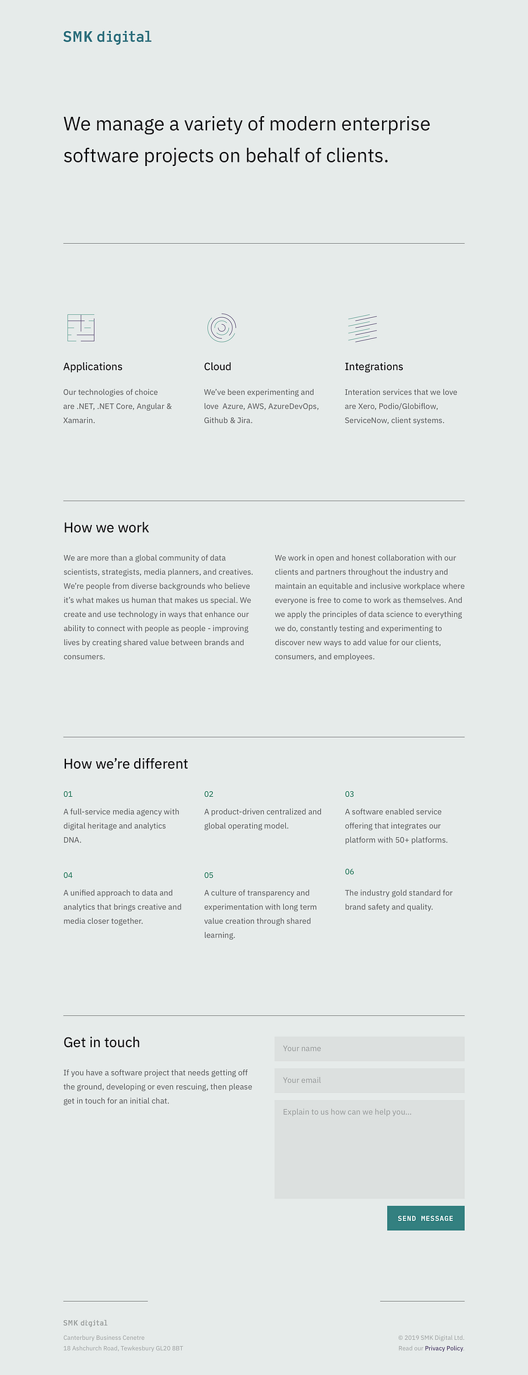
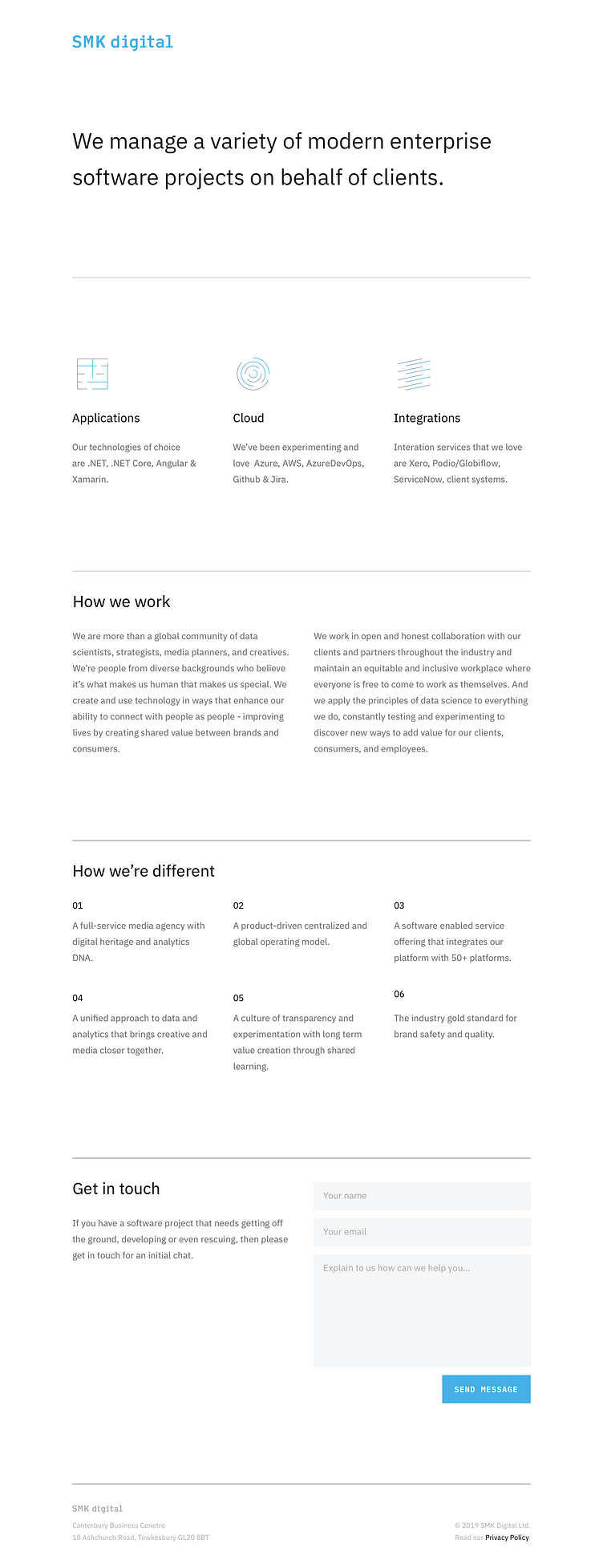
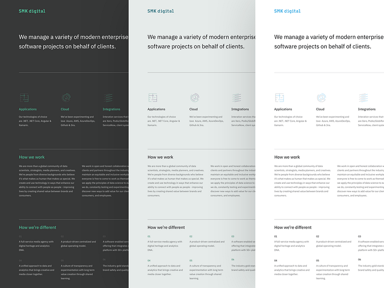


An interim client contacted me to “put a suit” on his very minimalistic landing page. And yeah, that's literally what he said. 🙂 This suit should be designed within 2 full days, so on this second day, I'm hesitating what colour choice to fine-tune. I try to avoid the safe approach—blue on white, and I kinda incline for a greenish hue. What do you people think? Also, the interface should be as minimal as possible, so I try to remove things as I feel, but do you think I should add something? The top area seems a bit too light in comparison to the rest. Something is missing, but I'm still struggling to find out what.
An interim client contacted me to “put a suit” on his very minimalistic landing page. And yeah, that's literally what he said. 🙂 This suit should be designed within 2 full days, so on this second day, I'm hesitating what colour choice to fine-tune. I try to avoid the safe approach—blue on white, and I kinda incline for a greenish hue. What do you people think? Also, the interface should be as minimal as possible, so I try to remove things as I feel, but do you think I should add something? The top area seems a bit too light in comparison to the rest. Something is missing, but I'm still struggling to find out what.