TrainingPeaks Redesign II
Hi there! 👋
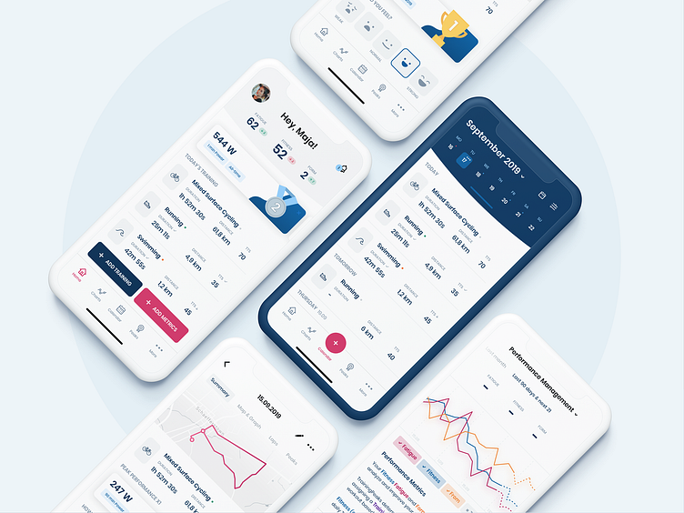
Here is another shot from the redesign of the training application for advanced athletes - TrainingPeaks.
In the original application, charts and calendar are on one screen. I decided to separate them, which makes the data more readable and clear.
Let me know your thoughts and hit the L button to appreciate it 💙
___________________ We're available for new projects! Drop us a line at info@qodeca.com
More by Qodeca View profile
Like
