Banking App Design Concept


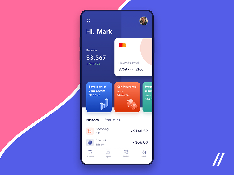


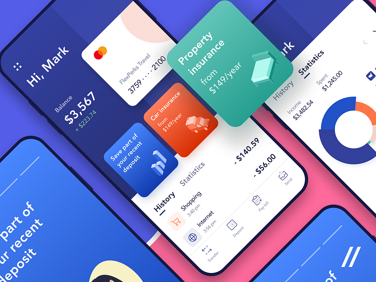


This is our attempt to create a better digital banking experience. Check out the screens we’ve designed! Main ideas:
🔵 To boost UI readability, we used color power. The blue-white mix helped us focus users on the most important functionality, separate different content areas and blocks. 💰To maximize UX, we decided to organize contacts by operations frequency. So, users can save time on common transactions. We are in love with this concept. Hope you like it as much as we do! Press 👍 to spread some love!
Created by Ilya Sablin
The team is available for new projects! Drop us a line: hello@purrweb.com | WhatsApp
PS We know to utilize UI/UX design to make users fall in love with a product. Check out how we used our skills to: - raise $400k as capital for startup - streamline cryptocurrency e-wallet - reboot a Real Estate startup - help newbies jump into investing - conquer the chef freelance market - simplify the life of event organizers And that's not all — you can find more case studies in our Blog! 💜
Join us on: Website | Instagram | Medium | Behance | Facebook
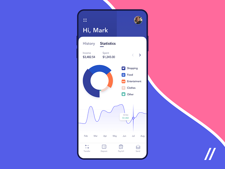
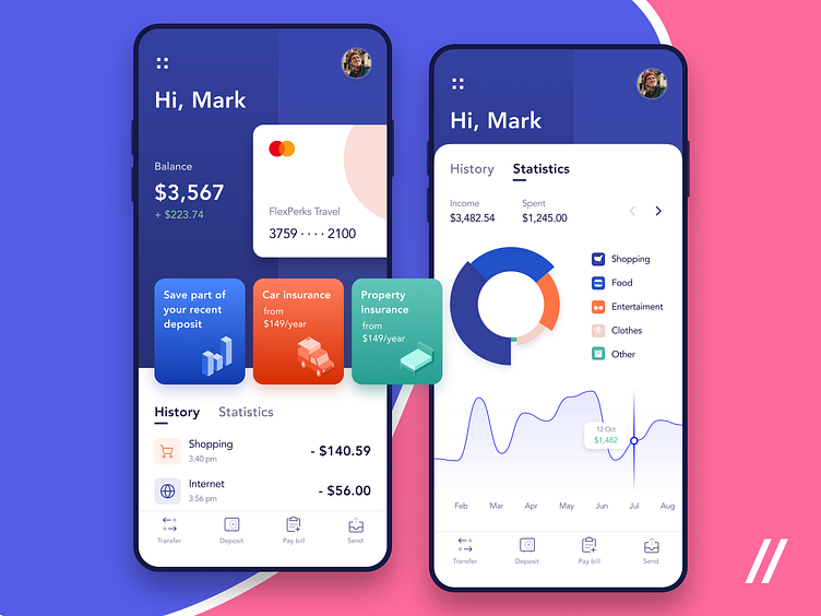
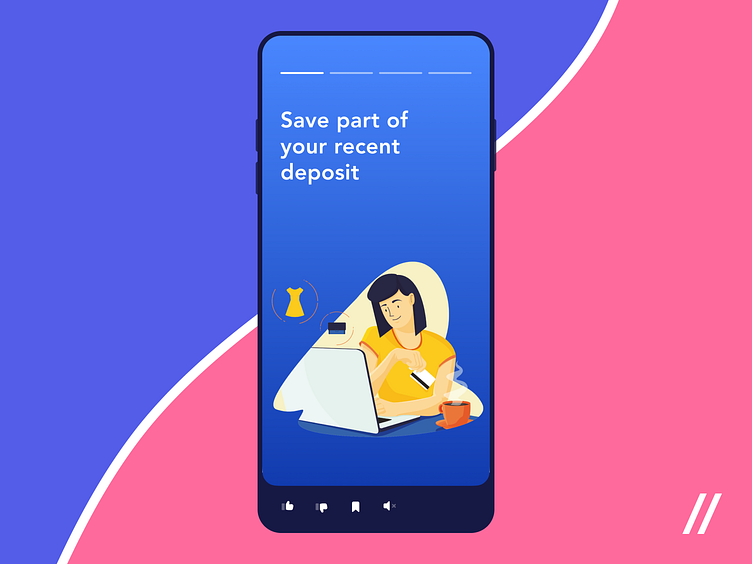