Jason Kaufmann — Landing Page, Color
Some additional color ways hidden in the easter egg.
—
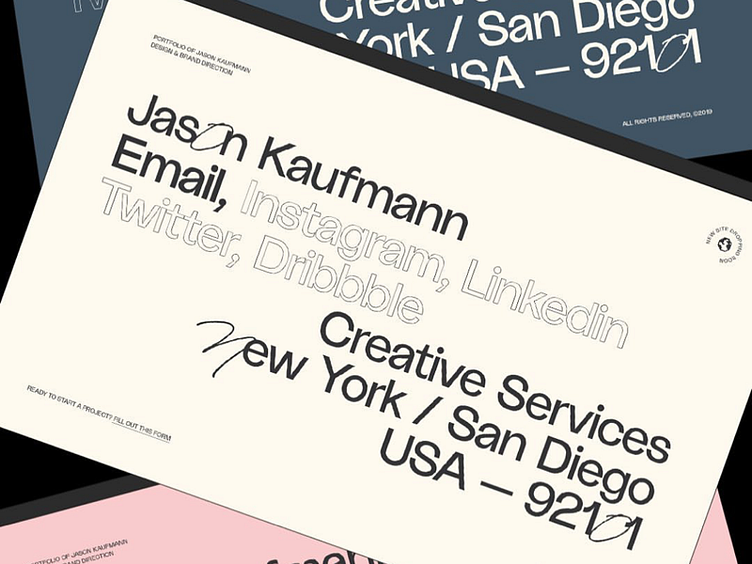
(type dilemma)
Man, I really love this font but as I’m designing the actual portfolio site I’m starting to run into a few problems.
For body copy, I have to reduce the weight from regular to semi-light to prevent the font from looking too chaotic and in full paragraph form it’s just not as clean as I want it to be. It kinda feels “loose” even after make adjustments and changing sizes bigger and smaller. Also with large sized type, the line height gets difficult to use when ascenders and descenders clash.
Time to decide if I should go with something a bit more generic (easier to use) or stick with something more styled but less legible/clean/professional.
Decisions, decisions.