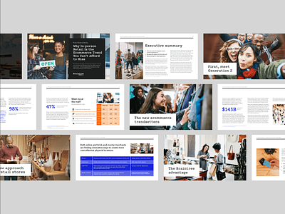
Horizontal Whitepaper Design
The Project: Braintree produces whitepapers as a valuable industry resource and trend report for the payments industry. Each one is written by our content team and designed by our brand design team.
This is the first whitepaper we designed in a horizontal layout. Prior to this, we'd used your standard 8.5" x 11" vertical orientation. Thinking about how our whitepapers and resource materials are typically viewed digitally, we thought going horizontal and eliminating the need to scroll on desktop would be a benefit to our viewers. If printed, the content fits on your standard sheet of paper.
An additional positive is that the layout is already suited to be dropped into a sales deck if needed.
---
About this whitepaper: From Clicks to Bricks: Why In-person Retail Is the Ecommerce Trend You Can’t Afford to Miss
"Motivated by changing consumer buyer behavior, more and more merchants are merging online and offline shopping experiences -- and leveraging flexible solutions to make payments seamless for their customers."
Check out the full whitepaper here: www.braintreepayments.com/resources/from-clicks-to-bricks
---
Braintree is a PayPal Service and provides global commerce tools to build businesses, accept payments, and enable commerce for their users. It’s the simplest way to get paid for your great ideas -- across any device, and through almost any payment method.
