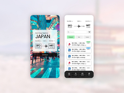
Daily UI #068 - Flight Search
Thoughts on Today’s Challenge
I used the momentum from yesterday’s challenge to help motivate me for the task at hand. Hotel booking and flight booking are tasks that usually take place in the same product or experience, or even simultaneously. With that in mind, I utilized some of my research plus designs from yesterday’s challenge to start strong.
My main design goals were to create a very sleek and simplified flight searching experience. In my opinion, most airline interfaces are a bit wacky and have way too much information to absorb. I wanted to condense the visual information to only the essentials. Most of the user input for the page would be under dropdown menus, such as selecting a departure date or selecting a flight. After the user taps on the flight that they prefer the component would expand to reveal action buttons.
The user would be able to save the flight, compare the prices, or purchase a ticket. The second two actions would take the user to the purchasing experience of the app.
-- -- --
Thanks for checking out my post!
Press “L” to like my shot and to keep me motivated to make it to the end! Feel free to leave any feedback as well, all words are welcome. 😋👍
-- -- --
The Challenge is to complete one unique User Interface design task every day, for 100 days. You can read more about it here: https://www.dailyui.co/
