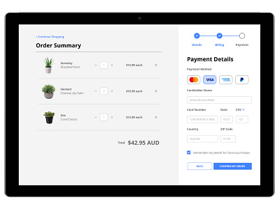
Credit Card Checkout - DailyUI Day 2
Here's a credit card checkout screen for Day 2 of the Daily UI challenge.
One thing I would do differently next time is to bump up the contrast of the grey, as it's currently a bit hard to see against the white.
What do you think? Let me know! 🥳
More by Joshua Braines-Mead View profile
Like
