Landing Page | Vivo Combo 2
🙋
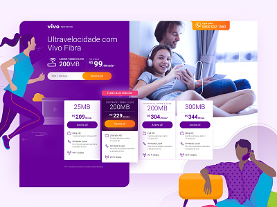
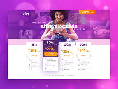
So, as the brand has changed it's visual guidelines I had to design a new layout for the Combo landing page.
Now, everything is a lot cleaner, the purple color must prevail and it's important to choose images that show real people - more than one -, enjoying the moment with each other.
The fonts has changed as well. Roboto is the main typeface used now.
Also, the brand included illustrations in the guidelines. These ones appear in lower sections of the page.
Important: The company sent the illustrations so I do not own any rights of it.
What dou you think? 😍
J
More by Juliana Souza View profile
Like

