eBu
Hi everybody 👋
As part of a hackathon organized by my university, my team and I imagined and designed an innovative concept around the following problem:
“How to improve the accessibility of our university library’s resources?”
1️⃣ Students Pain Points and Needs
👉 The current search & borrow platform maintained by the university library is overly complicated and outdated. Students are reluctant to use it.
👉 The university library is composed of small and distributed spaces. Finding a particular book or section in this maze can often prove to be a difficult task.
✅ To answer these problems we decided to design an intuitive and innovative search & borrow experience, made available to students through a mobile app (thus meeting gen Z + millenials expectations)
2️⃣ Looking for a book
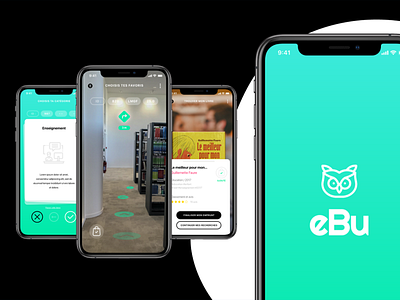
We've entirely redesigned the search engine to transform it into a fun, intuitive and innovative tool.
We also observed that no one knew how the books were stored in our university library.
Thus, we tried to make students understand the rating system and in particular how it's generated through our interface.
3️⃣ Finding a book
To easily find a book or a section, we imagined the use of augmented reality to offer students an accurate indoor mapping & navigation of the university library.
4️⃣ Borrow a book
Borrowing a book is made super easy by simply scanning its cover.
A summary sheet is generated with book-related informations as well as personalized recommendations.
In one tap, the book is borrowed!
✅ Credits : Icons on Flaticon.
(https://www.flaticon.com)
Pictures : Université Paris 13 Library & Unsplash.
Thanks for watching 🤙
