Bali Sunny | Brand Identity and Packaging Design
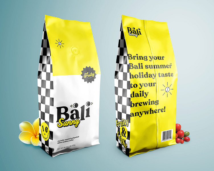
Bali Sunny is my initiation self project design for roasted coffee beans packaging. Bali coffee beans itself is often noted as having a rich aroma, with a smoky (wood) flavor and full body. These beans are well developed because it grown at mineral rich volcanic soil and practices that involve natural manure and shade-growing, allowing the coffee beans to mature slowly, despite being primarily High Grown.
The coffee is usually wet processed while the coffees trees are most often “organically grown” using manure from local farmlands, and shade-growing is frequently done. So I imagined that Bali coffee as a cheerful forever kiddos person that on the next step i've translate them to the main tone and manner.
The logo is inspired by the eyes of Balinese Pendet dancer. Pendet dance is used as a complement of ceremonies in temples or family shrines, as a symbol of gratitude, respect, and joy when welcoming the presence of the gods who descend from khayangan (realm of gods).
The yellow colour and sun-symbolization coffee beans was chosen because Bali has that "perfect land for enjoying summer holiday" vibes and the checkerboard tile is often found in Bali called Polèng. Polèng frequent use as a wrapper for sacred trees, rocks, and shrines to dispel demons.
Getting inspired and interested to make this project come true? let's discuss for further ideas :D
drop me a "HI!" to graphiclabsss@gmail.com for commission and collaboration project.