SR Monogram
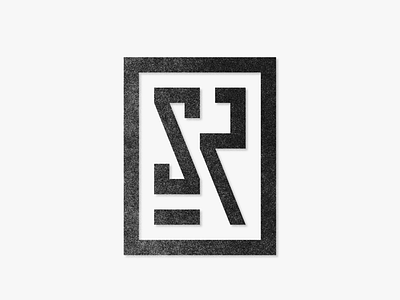
Did an "SR" monogram design for a real estate company. The client explicitly mentioned to not have any house or stone-related shapes, and opted for a more classy and sophisticated look. They have also expressed a preference for blocky elements. As someone who tends to round corners, this was an interesting project for me! I also tried to think outside of the box and created a stoney texture instead of using a shape element to subtly tie it back to the company's name. All in all, I'm pretty happy how this turned out! What do you think? Let me know your thoughts in the comments below!
