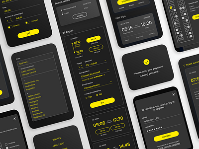
Flat lay contrast train app
Here's another shot from my project redesigning a Polish national carrier page, PKP Intercity. To make it right, for over 2 months I was conducting in-depth interviews, consultations with front-end developer, testing prototypes with participants and much more. All together, I created three versions (normal, dark mode and contrast). It wasn't a piece of cake, but I think it was totally worth it!
If you would like to read more about the process, full case study is available on Medium:
https://medium.com/visualitypl/pkp-intercity-redesign-and-case-study-of-polish-national-carrier-33d2a3eff5be
Have a nice day! :)
More by Katarzyna View profile
Like
