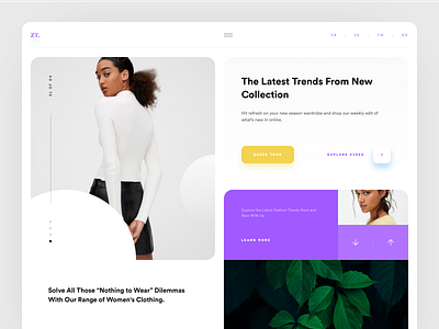
ZT. Landing Page
Hi there!
Quick overview: ZT. provides the best and largest selection of modern and lifestyle clothing at the core of the business.
Objective:
• Make the brand look fresh because of it's unnoticeable and dim filling, make it pop out.
• Increase conversion rate and put the main emphasis on the smooth perception based on the same content without any changes.
Used fonts:
• Circular: gorgeous geometric typeface with clean shapes
Don't forget to press "L" if you like it and check out attachments.
Cheers!
More by Serhiy Ozhibko View profile
Like
