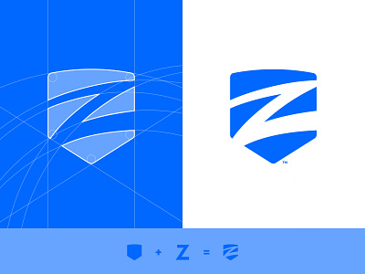
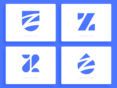
Ziptility - Logo Grid
What i love about this logo is the balance between the rigidness of the shield and the fluidity of the Z - almost like water 💧
This concept was created because the client really wants to pass the message that the company will keep you safe (shield) against the problems that water and wastewater utilities can cause on infrastructures 💦🛡️
Press Like if you would like to see more grid structures of my logos.
More by Wisecraft View profile
Like

