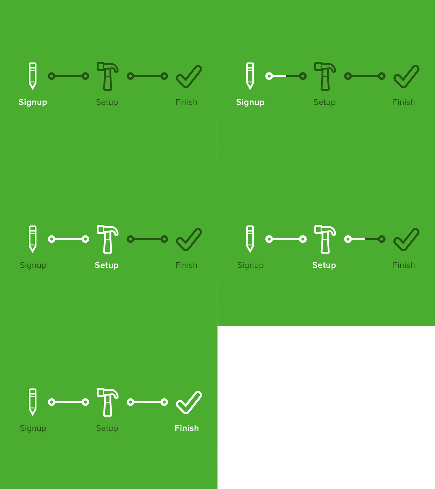
Progress Bar Icons
I recently redesigned the signup flow for publishers on Disqus. One of the requirements was creating a better progress indicator. I scoured the web for some inspiration. That's when I realized, most indicators are completely text-based or use bullet points and numbered lists. Why stop there? Icons add more context of their current, and upcoming steps. Additionally, as a user is completing a step, the progress bar moves.
Let me know what you think. More awesomeness to come!
More by Disqus View profile
Like
