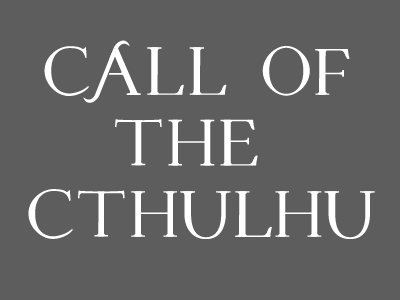
More letters on new font
An alternate A, needs a bit more work, looks a bit fatter than the other letters I think. It's possible that the thin line on the H should be a bit fatter too.
More by Vincent S Hasselgård View profile
Like

