Passbook Pull to Refresh UI
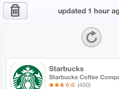
Today was the first time I'd used Passbook for a legitimate reason since the release of iOS 6. While toying around inside the info view of the Starbucks card, I noticed the pull to refresh UI was really off. The color of the arrow in the middle was barely visible in the circle and I came to find out that the pull to refresh UI color changes based on the color of the passbook card itself.
After people posting a few other examples of certain cards that created weird pull to refresh UI, I decided to see if I could make a solution. Why not keep the UI standard and matching to the card itself, not its header or border? It never changes and will be consistent, ensuring beauty all the way through and in all scenarios.
Here's what I came up with. Works for all cards regardless of color.
