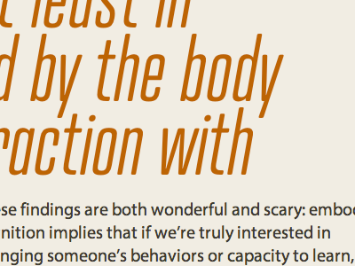
Type Set Match: Creating for the Brain in the Body
This is the initial volley of a Type Set Match, a fun way to spend time on Dribbble and an easy way to practice typography. Plus, swell excerpts from Contents Magazine.
REBOUND ME
Find simple instructions and more about Type Set Match here: http://nicewebtype.com/x/75
ABOUT THE TYPOGRAPHY
See the live Typecast composition.
Long headline, so I started with that. I wanted a condensed face, and Atrament, with its rounded features, felt perfect for a text about the human aspects of technology.
I also wanted a tightly woven texture out of the heading; this much big type, spaced loosely, would be tough to manage. The white space congruity was a stroke of luck — compare the vertical volumes of counter height and line spacing to the similarly proportioned relationship between counter width and letterspacing.
Myriad Pro was the only text face, of the ten or so I tried, that felt compatible with Atrament. Flipping among text faces in Typecast made it easy to find one by feel. Before doing that I tried picking a text face in isolation, bringing to bear various bits of advice I've heard about combining fonts; it didn't work.
Another thing to mention here is how I've brought the paragraph up into a pocket created by the headline. Some elements of this composition make me wonder how I'd make it all work responsively — it would be a good challenge, and it would take more than an afternoon! But at least I would have this idea, here, in my catalog of assumptions.
NERD STUFF
* https://typekit.com/fonts/myriad-pro/n4/wfs
* http://modularscale.com/scale/?px1=20&px2=&ra1=1.667&ra2=0

