iOS 6 Music App Redesign


Saw Ari's shot, felt inspired.
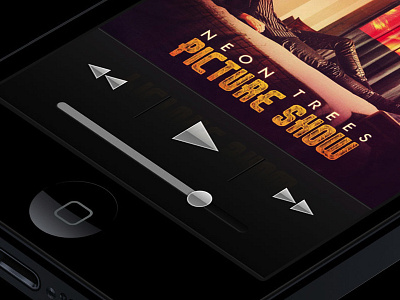
Also, I'm kinda bummed about the new design of the "Now Playing" screen of the music app in iOS 6 because of the confusing UI cues, un-hinted pixels on icons and so forth.
My redesign is simple, mocks the iPod Nano's, and is simpler.