Three
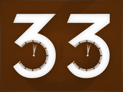
Logo for a recent personal project I've been working on. I can't figure which letter from I like best. I know which way I'm leaning, but I'll refrain from saying for now. Also, notice the different halftone gradient in the middle ticker. Open for suggestions on that, or anything else! Hopefully you dribbblers can help me out! -will
More by Will Haynes View profile
Like
