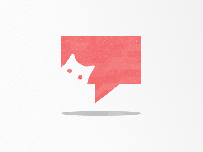
Whiskers
Part of a larger logotype but this is the part that I'm having a bit of trouble with.
The client was really stoked with the direction overall - I can't say much but it's for a niche, social media tool for geeky people. The only thing was they thought the cat looked a bit shadowy/spy-like.
Suggestions would be wonderful at this point! Cheers.
More by Kristian Hay View profile
Like
