Destiny Homes Logo
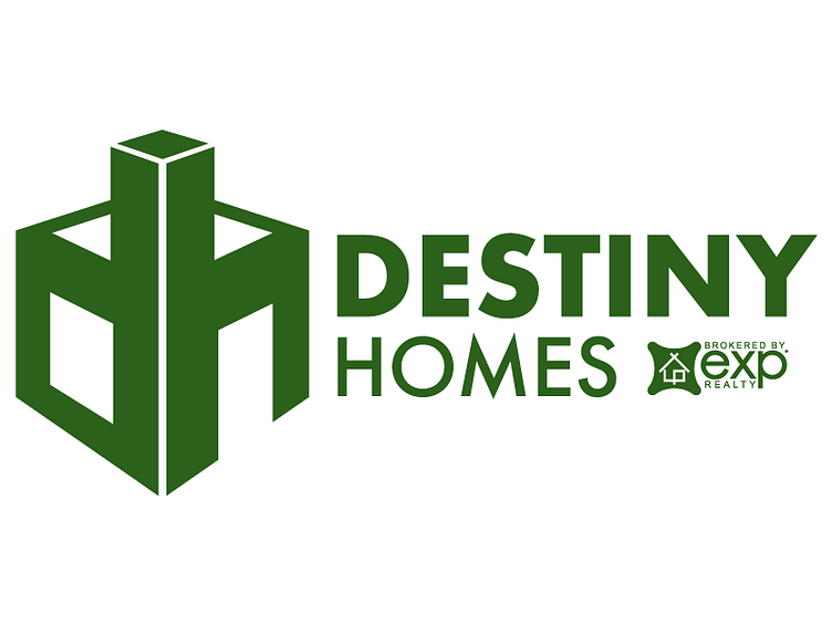
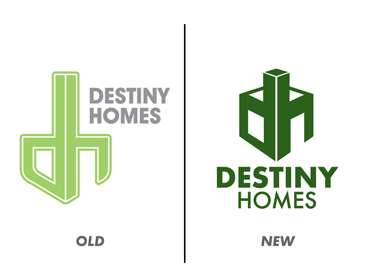


I recently had the opportunity to update the logo for a local home builder. I wanted to keep the spirit of their old logo while modernizing it and adding some other fun features. The letters "d" and "h" lent themselves easily to being turned into a house using negative space for the window and door. I was also able to give the logo more strength and stability which are both important traits for a homebuilder to portray. Finally, I updated the color scheme to be bolder and to stand out when displayed on signs in yards and developments.
I recently had the opportunity to update the logo for a local home builder. I wanted to keep the spirit of their old logo while modernizing it and adding some other fun features. The letters "d" and "h" lent themselves easily to being turned into a house using negative space for the window and door. I was also able to give the logo more strength and stability which are both important traits for a homebuilder to portray. Finally, I updated the color scheme to be bolder and to stand out when displayed on signs in yards and developments.