Crossroads Health Logo Mark
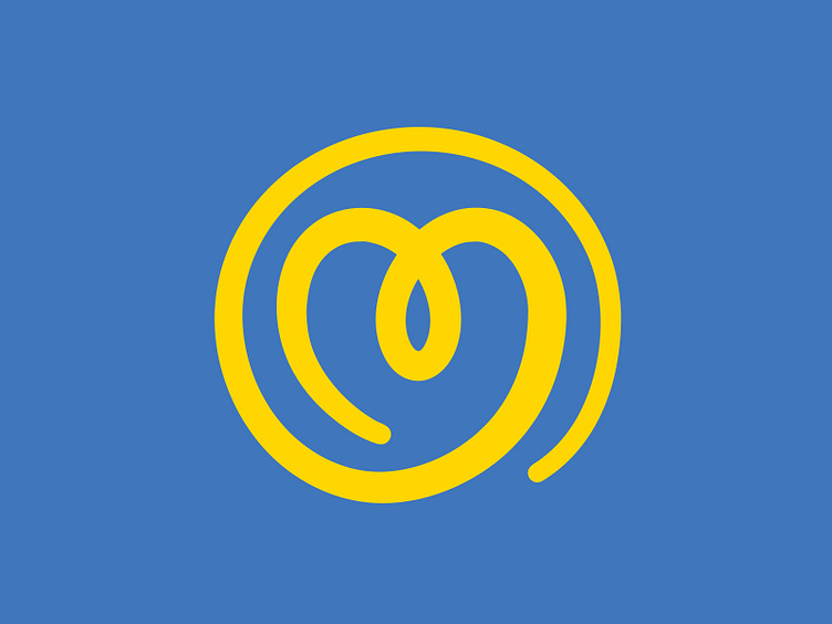
We've been working on the re-brand of Crossroads Health, a 501(c)(3) non-profit organization that offers integrated services for recovery and mental health. This is their approved logo mark.
The heart is a symbol for empathy, passion, and purpose. The loop represents an awareness ribbon. The circle/sun and one line represents unity, commitment, and community. When in yellow, the shape pays ode to the previous logo, which was a yellow sunburst shape. The varying line thickness, going from thin to thick to thin, represents personal journey.
This shot is a quick teaser. Can't wait to share more with everyone later!
2019 Dribbble Shots_Crossroads Health Logo Mark.jpg
300 KB