Designer Fund
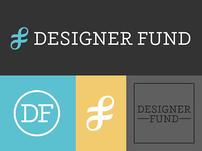
Recently finished logo and visual identity development for the Designer Fund. The main logo features a custom slab serif alongside a calligraphic-inspired abstract 'df' mark. There's also a simple secondary monogram, a variant for square formats and an alternate for small sizes. Bigger images and colours in the attachment.
We went through some extensive development and there's a lot of background, but to summarise, the Designer Fund's mission is to invest in designers building businesses with positive social impact. Attributes central to the organisation are connections, collaboration and the idea of giving something back.
The mark connotes a strand of DNA, representing the belief that design should be at the core of a great company. It's also an interconnected path, symbolising the strength of connections within the community.
I'm working on a portfolio update with sketches, revisions, etc. which should be up soon. In the meantime, thanks to @James T. Edmondson for the help on this one – especially with the inevitably problematic 'S'.
Edit: I was actually quicker than planned and just finished the portfolio update.

