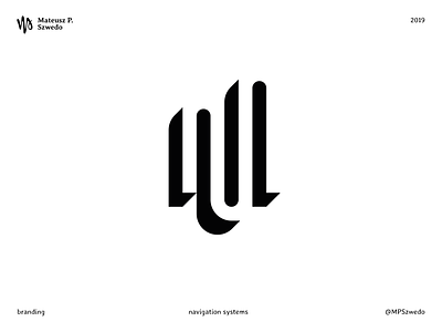
Navigation systems
A flexible visual identity for navigation systems.
The main goal was to design a dynamic pictogram, capable of changing itself without losing its recognizability.
The initial M (in the negative space) was drawn without sharp angles to appear more friendly and remind of a path, that leads you from point A to B (the mission of the brand).
The simple dots pattern was added for a more playful look and with the purpose to be used, joining them, to indicate a route.
More by Mateusz P. Szwedo View profile
Like
