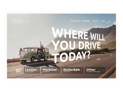
Urend website
Recently i finished main page of the website for UREND. Background picture tells a story about good traveling with friends. It is close to the consumer. Warm colors blend well with white elements and white big slogan. Also main page has quick pick where you can find popular destinations.
Hit «L» if you like it.
Open to new projects, clients and collabs
looktwicedesign@gmail.com
More by Sergey Golodyaev View profile
Like
