Averest Camp logo idea

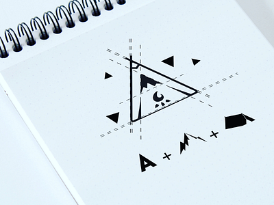
Consistency is key 😁 ~ I always like to treat every logo or concept as piece of art🖼 - As you can see in this logo , I tried to combine the letter 'A' of the brand name AVEREST not EVERSET, with a top of a montain 🗻inside it, and I tried to make the logo looks like a old hand made camp⛺ (red Indian camp)then I added some details to it, like the campfire🔥, the mountains edges in the same time the letter 'A' edges, on the both sides of the campfire. ~ And this this the result 😁 ~ Make sure to follow me for more, tag anyone for some #insperation DM me to make your next logo story ~ And I'm looking forward to read your comments ❤ Also, Check out the logo process : https://m.youtube.com/watch?v=_o87Y9Ls6kM