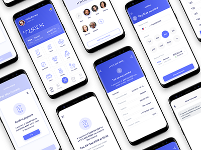
Financial App Airtime Top Up Flow
PROJECT OBJECTIVE
The aim was to design an intuitive and efficient user experience for airtime top-ups, catering to pre-paid or pay-as-you-go users. The goal was to simplify the process and reduce friction, ensuring users could top up quickly and confidently.
APPROACH
User-centered Design: Conducted research to understand user pain points, focusing on ease of use, speed, and clarity. Created personas to reflect the diverse needs of users, from tech-savvy individuals to less experienced users.
Wireframing & Prototyping: Developed wireframes to outline the flow, followed by interactive prototypes. Focused on creating clear entry points, simplified navigation, and accessible design elements.
Visual Design: Designed interfaces with a minimal and intuitive layout, focusing on high readability and easy interaction. The color scheme and button placement were strategically chosen to draw attention to essential actions, such as selecting an amount and confirming payment.
User Testing & Iteration: Conducted user testing sessions to gather feedback, which informed iterative design improvements. Focused on clarity of information (e.g., amount and phone number visibility), ease of selection, and error prevention.
Feedback & Confirmation: Emphasis was placed on providing immediate feedback at each stage, with visual indicators to confirm selected amounts and phone numbers. A final confirmation screen with key information and a “Pay” button was designed to ensure users felt confident before completing the top-up.
THINKING
User-Centric Simplicity: The design aimed to reduce cognitive load by minimising unnecessary steps and focusing on core actions like selecting an amount and confirming details.
User Control & Flexibility: Provided options for manual input of phone numbers as well as selecting from saved contacts, ensuring flexibility for different user preferences.
Consistency & Usability: Leveraged best practices in mobile UX, ensuring a consistent experience across devices with touch-friendly buttons and readable content. The goal was to make the top-up process quick, effortless, and intuitive, regardless of the user’s device or level of technical experience.
Error Prevention: Designed with safeguards, such as a clear “Cancel” option, allowing users to easily correct mistakes. This ensured that the process remained stress-free, even if users needed to backtrack or adjust their selections.
This approach ensures that the user journey is seamless, accessible, and effective, making the airtime top-up process as user-friendly as possible.
Feel free to share your views on this! ____
Do you need some help? Feel free to reach out!


