Design Direction | Data & Infrastructure
We're working with a client in the data & infrastructure industry to design and develop an entirely new experience for their customers.
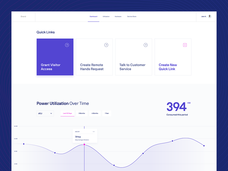
Here's some early design direction exploration we did, with the goal of making a dashboard feel less... dashboardy... through the use of white space and full-bleed content.
We ultimately moved in another direction (which we're absolutely pumped about), but exploration is always an exciting phase of any project.
More by Termini Design View profile
Like
