KGT branding
Tailored. Integrated. Effective.
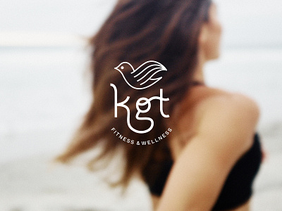
Merging both medical and fitness backgrounds, KGT’s approach to fitness training and holistic wellness is unlike any other. We needed to differentiate KGT’s branding from other personal trainers by highlighting sophistication and quality while keeping it fresh, modern, and fun. Lifestyle photography captures KGT’s ethos. The logotype is a bold, hand-lettered monogram that features a woman’s hair flying through the wind to represent movement, as well as an illustrated bird icon to give the feeling of freedom and peace.
