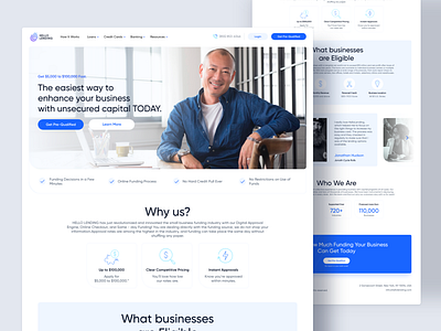
HelloLanding - Landing Page Business Loan
🔥 Project Intro:
Client: HelloLending
About the Client: Fintech company, we provide advances to small-medium sized businesses
Targeted platform: Web & Mobile users
Scope: 5+ Screens
———
🎯Target users:
Small-medium sized business owners.
———
👨💻 Design Process
1⃣ Client Interview
2⃣ Research
3⃣ Sitemap
4⃣ Wireframes
5⃣ Mockups and Prototype
6⃣ Design Handoff
———
🎯 Project goal: Building a platform theme based on gaming colors and elements, easily recognizable as a marketing agency dedicated to gamers. Users who visit the site via BavaMedia should easily and quickly access services, projects, and contact.
———
🤔 Tips
What to keep in mind while designing for a Business Loan Company:
-Provide a very light and simple design, these styles are related to comfort and transparency.
-Use colors that provide trust, security, calmness. In most cases, people refer to blue as a save color.
-Use icons with a strong message, they need to be well illustrated.
-Include illustrations to constantly drag users attention and admire spacings providing content focus.
-These types of websites are usually text-heavy, design with readability in mind.
———
🧲 What should the landing page include:
-Strong Headline for immediate attention catch - Helps to provide the very first positive impact on the customer
-Proof & Client Testimonials - Helps in gaining trust and providing comfort on decision making for your customer.
-Call To Action Button - The primary action on the page or the page goal should be consistent. The main button is usually placed on more than one place, the navigation menu which stays always on screen, page header and also page banners.
-Include a Phone number - Many people would like to have a personal conversation rather than filling in the form straight away.
