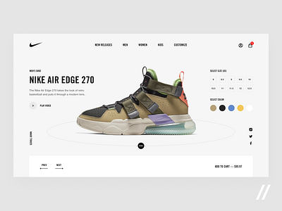
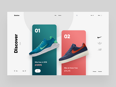
Nike Promo Page Design Concept
Whether you’re selling feminist T-shirts or vegan gym clothes, marketing efforts are crucial to spread the word about your brand.
This is our attempt to rethink the way Nike promo page looks and feels. Check out what we’ve done so far!
Core ideas:
👟 The ability to rotate shoes within 360 degrees increases the chances of walking out a happy customer. Simply because it shows all the details. From heel to toe.
📍 We initially planned to create an appealing promo page, although the primary focus was placed on the product itself. To achieve that, we used the power of space and font weights.
If you like this design, press 👍 and comment!
Created by Ilya Utkin
The team is available for new projects! Drop us a line: hello@purrweb.com | WhatsApp
Join us on:
Website | Instagram | Medium | Behance | Facebook

