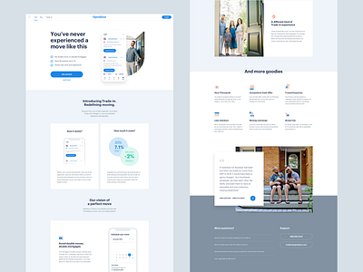
Layout experiment
Apple's website is dope. As a web designer it's been one of my main source of inspiration for clean web page layout.
I generally copy some sections from random pages of apple.com and adapt my content/copy for a first draft of the page as a wireframe. Doing this allowed avoid the awkward wireframe stage in a project where not everybody sees the design and copy coming together (I'm talking about marketing folks here).
All that to say, I love to copy apple
More by Opendoor Design View profile
Like
