Left to spend
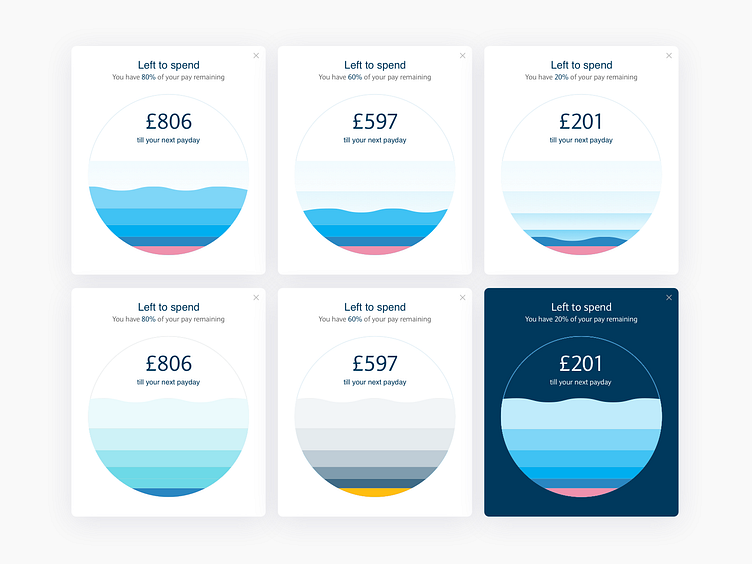
This design was about demonstrating how much the user has left to spend in their account. The water provided a nice metaphor and made the data less dry and more visually appealing.
The top designs show how the water drains away, the bottom designs show how versatile the design can be with different colors and treatments.
More by Ben Smith View profile
Like
