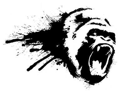
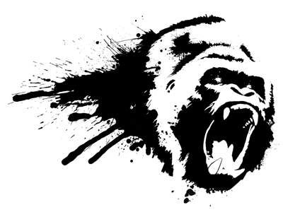
Gorilla Logo - Updated
Wanted to take the previous design, make it a bit more dynamic and polished - reduced the black area to the right of the mouth and right side of head to give it a more aggressive, forwards movement.
Also softened the outline of the bottom left tooth that looked a bit too clean.
Larger scale image attached for detail.
More by Andy Marshall View profile
Like


