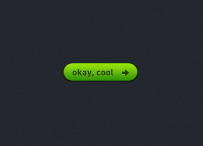
Okay, Cool
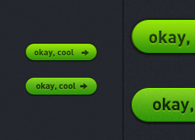
I made my adjustments assuming the colour scheme and general feel were to stay fairly similar, here were my changes (original on top, mine on the bottom):
• Moved the text and arrow up to vertically center
• Moved the text and arrow towards each other to center horizontally with the perceptual length of the button (rounded edges taken into account)
• Tiny adjustments to text to make vertical strokes stronger
• Made the gradient slightly less intense, and moved the center upwards to give more dimension
• Made adjustments to the highlights and shadows on the button, text, and arrow to give more dimension
• Darkened text to add a bit more contrast
• Added a tiny bit of noise to make the button more tactile