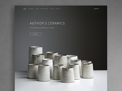
Author's Ceramic
HI! It's my landing page for Author's Ceramics studio. We tried to translate personality and authenticity of the studio. So I chose gray palette with a brown tint and decided not to make a call-to-action button catchy. It's my atypical Landing Page :) Do you think that gray can attract the attention and interest of a user?
More by Karina Kashuba View profile
Like
