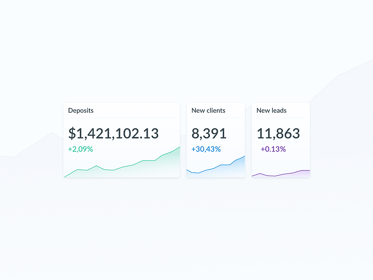
Dashboard Cards [WIP]
Trying a different style for dashboard cards. Any thoughts?
I feel like the smaller size is too small, but it's also important to keep the width of cards aligned to the grid in order to maintain the balance and make proper use of the screen.
It's also an issue for devs when creating modular dashboards, where the user can drag&drop, and resize the cards. The minimum and maximum width (and how they look) need to be defined in design. It's a good idea to define these based on both data visualization that the card holds and the data that it will be showing.
More by Jovana Andjelkovic View profile
Like
