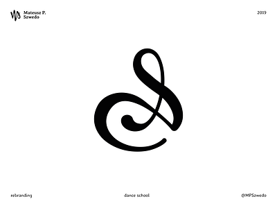
Dance school
New logo for a dance school.
The starting point was the old logo: the initial (A) of the signature of the school’s owner. After the brief we decided that the best path to go with was a rebranding of the letter’s shape, preserving the old visual look but at the same time adding some modernity and harmony, and expressing balance and dynamicity. The secondary goal was to give the logo a visual meaning, bringing an abstract shape of a ballerina into the letter.
The final result has the intention to be elegant, and it was carefully made to work well also in smaller sizes.
More by Mateusz P. Szwedo View profile
Like
