Planned Parenthood
Thanks for all the feedback. This is kind of where I stand now.
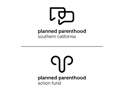
Planned Parenthood has a political arm that serves as their agenda group called their Action Fund. So since the mark on the left is such a bold and aggressive logo, I’m going to stick with that. Yes I realize using a uterus/penis combo is not very PC but given their stance and policies, I believe they need a logo that instills strength and solidarity through a strong, controversial mark. There is no getting away from what they do and sugar coating a topic such as this is counterproductive.
The other one will be for all their other services like education and healthcare. There’s a shield in there if you missed it.
Agree/disagree?
More by Ricky Linn View profile
Like

