Mercury Logo Design Contest
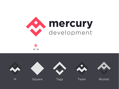
For more logos @simpul.design If you are looking for a logo design ->kesh14kish@gmail.com . 1. M- It is formed in the negative space to indicate the transparency of the company.
2. Square - It indicates the strength, stability, efficiency if the company. Also, the square rests on vertex to indicate the dynamic & adaptive nature of the company.
3. Tags are the indicators of the work company does i.e CODE.
4.Team- It comes in the middle of the square to represent that they bound the whole company by the contribution of each individual.
5. Rocket- The aerodynamic shape indicates the smooth and fast-moving growth of the company.
Also, the negative spaces explain the flow of work and output in the form of a small square that is surrounded by the team and company to indicate the quality and responsibility they have.
More variations coming soon😊
