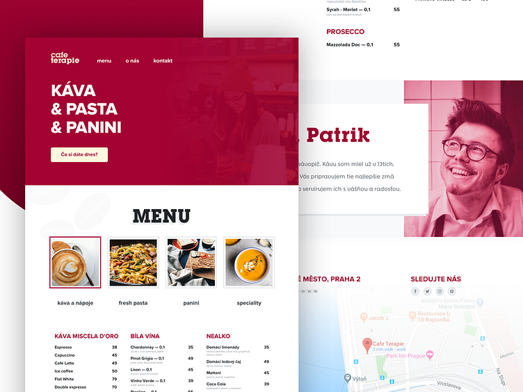
Restaurant Landing Page — Coffee & Pasta place
Hey friends!
I recently created this design for a Czech coffee & pasta & panini place near where I work now.
I mostly focused on using well-known colors of this place - burgundy and light yellowish and simple details, like coffee beans, that add life to the website.
How do you like it? Let me know in the comments :)
Thanks!!
More by Martin Galovič View profile
Like
