Manderley Restoration Trust: Daily Logo 04

The prompt for Day 4 was to create a logo using only a single letter. The first letter that occurred to me was R, which immediately made me think of Daphne du Maurier's novel "Rebecca" (where much is made of the title character's striking, distinctive way of writing an R).
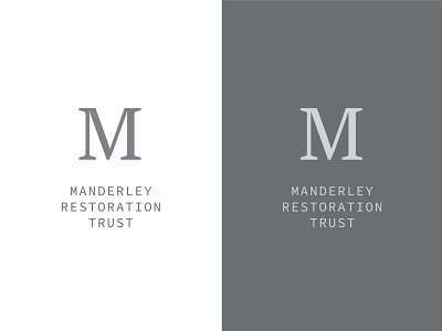
Since many book jackets for "Rebecca" feature a dramatic R, I didn't want to risk copying their approach by using an R myself. So I borrowed another name from the novel (Manderley, which is the estate where most of the story takes place) and decided to use M.
Since Manderley is an old and elegant place, I chose a traditional-looking serif typeface for the M. I looked for a typeface whose M had evenly-weighted strokes and was close to square, to increase the symmetry and harmony of the design. The gray color was inspired by the gray stone from which Manderley is built.
Lastly, I selected a sans-serif, very minimal typeface for the organization name, to make a clear contrast with the M and to suggest a modern organization. "Manderley Restoration Trust" isn't a name from the book; it's a nonprofit I invented whose mission is restoring the estate. As for why Manderley needs restoring...read the book or watch the movie!